
Three summers ago, I came back from a trip to the Amalfi Coast and hated my own house.
Not in a dramatic way. I just walked into my living room, dropped my suitcase, and thought: this room has absolutely no personality. Beige walls, a brown sofa I bought because it was “safe,” and curtains that matched nothing in particular. Meanwhile, every villa and little seaside cafe I’d just spent two weeks in felt effortless: white plaster walls, blue shutters, sun-bleached wood, linen curtains moving in the breeze.
I told myself I’d recreate that feeling at home. It took me almost a year, a few paint mistakes, one very regrettable rug purchase, and a lot of trial and error to actually get there. But I did get there, and along the way I figured out what actually makes Mediterranean coastal style work versus what just looks like a Pinterest board that never made it past the screen.
This guide is everything I wish someone had told me before I started buying things.
What Mediterranean Coastal Style Actually Means (It’s Not Just Blue and White)

Here’s the thing I got wrong at first. I thought Mediterranean coastal meant “blue and white nautical stuff,” like I was decorating a beach house in a catalog. So I bought a navy striped rug, some anchor-shaped hooks, and a few seashell candles. It looked more like a gift shop than a home.
Real Mediterranean coastal style pulls from the actual coastlines of Greece, southern Italy, Spain, and parts of southern France. It’s sun, salt air, whitewashed walls, terracotta rooftops, and materials that look like they’ve weathered a few decades of sunshine. The blue shows up, but it’s usually a supporting color, not the whole show.
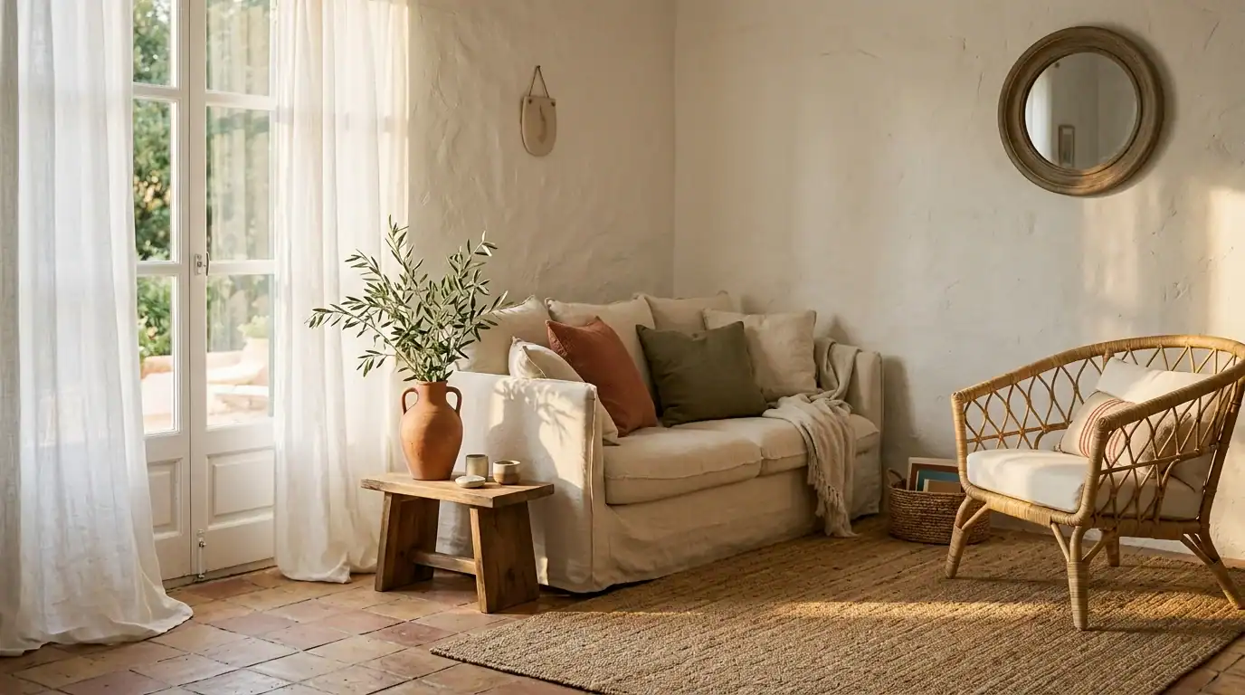
The bones of the style are texture and light. Rough plaster. Natural wood that isn’t too polished. Woven baskets. Stone. Linen that wrinkles because it’s actually linen. It’s less “theme” and more “feeling.”
The Color Palette That Actually Works (And the Mistake I Made First)

My first mistake was painting one accent wall a deep navy, thinking it would read as “coastal.” It read as a nursery, honestly. Too saturated, too flat, no warmth to it.
What actually works is a base of warm whites and sandy neutrals, then layering in color through smaller pieces. Think:
- Warm white or off-white walls (I ended up using Sherwin-Williams “Alabaster” after testing four different whites)
- Sandy beige and warm taupe for larger furniture pieces
- Terracotta or rust for pottery, cushions, or a single accent piece
- Olive green from actual plants, not just paint
- A dusty, muted blue, think weathered shutters, not swimming pool
The trick is that the blue and green should feel a little faded, like the sun bleached them a bit. Bright, saturated colors break the whole calm, sunbaked feeling the style is built on.
Textures and Materials: This Is the Real Secret

Honestly, this is the part most people skip, and it’s the part that makes the biggest difference.
If your walls are smooth and flat, and everything in the room is a hard, shiny surface, it doesn’t matter how “on trend” your colors are. It won’t feel Mediterranean. It’ll feel like a showroom.
What changed my living room wasn’t paint. It was texture:
- Limewash paint or plaster-effect paint on one or two walls instead of flat paint. I used a limewash kit from a small Etsy shop, and it gave the wall this soft, cloudy, sun-worn look that regular paint just can’t fake.
- Natural fiber rugs, jute or sisal, instead of anything synthetic or overly plush.
- Linen everywhere it makes sense. Curtains, throw pillow covers, even a slipcover on an old chair. Linen wrinkles, and that’s the point. It looks lived-in, not staged.
- Rattan and wicker for lighting, baskets, and even furniture frames.
- Real wood with visible grain, ideally something with a slightly weathered or oiled finish rather than a glossy lacquer.
Mixing rough and smooth textures side by side is what gives the room depth. Smooth plaster next to a rough jute rug next to a soft linen cushion, that contrast is doing more work than any color choice.
Furniture That Actually Nails the Vibe

I used to think furniture shopping for a specific style meant buying everything new and matching. It’s actually the opposite here. Mismatched, slightly imperfect pieces look more authentic than a matching set from one store.
A few things that worked well for me:
- A slipcovered linen sofa instead of a leather or velvet one. Mine is from a mid-range brand, and the loose, relaxed cover does half the styling work on its own.
- A rattan or cane accent chair. I found mine secondhand on Facebook Marketplace for $40 and just added a new cushion.
- A low wooden coffee table with rounded edges rather than sharp glass and chrome.
- Woven pendant lights instead of anything metallic or industrial.
- Open wood shelving instead of closed cabinets, so you can actually see the pottery and baskets you’re collecting.
If you’re working with a tight budget, secondhand furniture is honestly your best friend here. A slightly worn, imperfect wood table looks more Mediterranean than a brand-new one anyway.

Lighting Matters More Than People Think
A few things that helped:
- I swapped heavy curtains for sheer linen ones so light actually pours through during the day instead of getting blocked out.
- Warm-toned bulbs (2700K, not the cooler 4000K office-y ones) make a massive difference in the evening. Cool white light kills the whole warm, sunbaked mood instantly.
- Woven or rattan pendant lights cast this soft, dappled shadow pattern on the ceiling that honestly looks better than anything I could’ve designed on purpose.
- If your space doesn’t get much natural light, a few well-placed warm lamps with linen or paper shades fake it pretty convincingly.
Step-by-Step: How I Actually Redid My Living Room on a Budget

I did this room over about four months, mostly on weekends, and spent under $900 total. Here’s roughly the order I’d do it in again:
- Paint first. I repainted the walls a warm white and did a limewash accent wall behind the sofa. This alone changed the whole feel of the room before I bought a single new item.
- Swap the rug. I sold my old patterned rug on Facebook Marketplace and bought a natural jute one. This step made the room feel instantly more grounded and warm.
- Slipcover or replace the sofa. If your sofa is in good shape but the wrong color or fabric, a linen slipcover is way cheaper than buying a new one. Mine cost about $180.
- Add one natural statement. For me, it was the rattan chair. Pick one texture-heavy piece to serve as the visual anchor of the room.
- Layer in textiles. New linen throw pillow covers, a woven throw blanket, sheer curtains. This step is cheap but makes a huge visual impact.
- Bring in plants. Olive trees, if you can find a faux one that looks decent, or anything with silvery-green leaves. I have two faux olive trees from HomeGoods that fooled every guest for months.
- Style your shelves with pottery and baskets. Terracotta pots, ceramic vases, woven baskets for storage. Thrift stores and Etsy are goldmines here.
- Switch your bulbs last. Warm white bulbs across every lamp in the room tie the whole thing together.
Room-by-Room Ideas

Kitchen: Open wood shelving instead of upper cabinets, terracotta or handmade ceramic dishware on display, a woven pendant light over the island, and if you can swing it, small terracotta tiles as a backsplash. Olive oil in a glass cruet on the counter isn’t just practical; it looks great too.
Bedroom: Linen bedding is non-negotiable here. A rattan or wood headboard, warm white walls, and one dried or faux eucalyptus branch in a simple vase on the nightstand. Keep the palette calm. This room should feel like the quietest part of the house.
Bathroom: Small terracotta or zellige-style tiles, woven baskets for towels instead of closed cabinets, a wood stool, and, if your budget allows, brass fixtures instead of chrome. Brass warms up a bathroom instantly.
Outdoor space: This is where the style really gets to shine. Terracotta pots with olive, lavender, or rosemary, a simple wood or wrought iron table, string lights with warm bulbs, and linen or canvas outdoor cushions.
Common Mistakes to Avoid

A few things I’d tell my past self before she bought a single seashell candle:
- Don’t go full nautical. Anchors, ship wheels, and navy stripes read as “beach house gift shop,” not Mediterranean coast.
- Don’t use cool-toned whites. A stark, blue-based white paint makes the whole room feel clinical instead of warm and sunbaked. Test warm whites with actual samples on your wall before committing.
- Don’t skip texture for the sake of a clean look. A minimalist room with no texture just looks empty, not Mediterranean.
- Don’t overdo the blue. It should be an accent, appearing maybe twice in a room, not the dominant color everywhere you look.
- Don’t forget plants. Olive branches, lavender, rosemary, even faux versions, do a lot of heavy lifting for this look, and people skip them constantly.
- Don’t buy everything from one store. A matching furniture set from one catalog looks staged. Mixing secondhand, thrifted, and new pieces looks like a home that’s evolved over time, which is exactly the feeling you’re going for.
Conclusion
What I’ve learned after living with this style for a few years now is that it’s not really about buying the “right” things. It’s about slowing down and picking pieces that feel a little imperfect, a little sun-worn, a little touched by hand.
If you’re starting from a beige box like I was, don’t try to do it all in one weekend. Start with paint and texture, live with it for a bit, and let the rest come together slowly. That’s honestly how it comes together on the actual coastline, too. Nothing there looks like it was finished last Tuesday, and that’s exactly why it feels so good to be in.